About
Digital Edge specializes in building state-of-the-art, energy-efficient data centers to revolutionize digital infrastructure across Asia Pacific. The company sought a corporate website revamp to align with its innovative brand and communicate effectively with its diverse user base.
Scopes
Brand analysis and refresh
Competitor and website audit
Information architecture redesign
UI/UX enhancements
Design system creation
Challenge
Digital Edge needed a multilingual, user-friendly website to cater to two key groups: hyper-scalers and retail clients. The existing brand image also needed refinement to meet accessibility standards and communicate the company’s forward-thinking yet approachable personality.
Design Process
Phase 1: Research and User Identification
We started by identifying key user personas:
Hyper-scalers, who value tech innovation and financial stability.
Retail clients, who prioritize market familiarity and customization.
Our competitor analysis helped us pinpoint opportunities to create a more engaging and user-friendly digital experience.
Phase 2: Ideation and Branding
Creating a website that was on-brand and accessible was a top priority for Digital Edge. Working with Bonsey Design, we provided insights to ensure the brand aligned with accessibility standards.
One critical insight was related to typography: the website had to cater to multilingual users with diverse scripts, including Chinese, Korean, English, and Japanese. To address this, we recommended Noto Sans, a typeface known for its modular design and ability to harmonize across languages. This choice ensured a consistent and user-friendly experience for all audiences, regardless of the script direction or style.
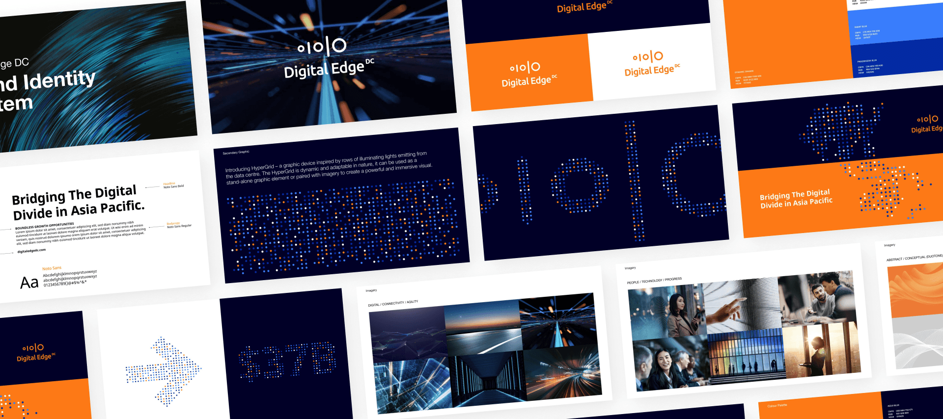
In tandem with these considerations, we developed a streamlined information architecture that reduced content overload and made navigation intuitive for both hyper-scalers and retail clients.
Phase 3: Wireframing
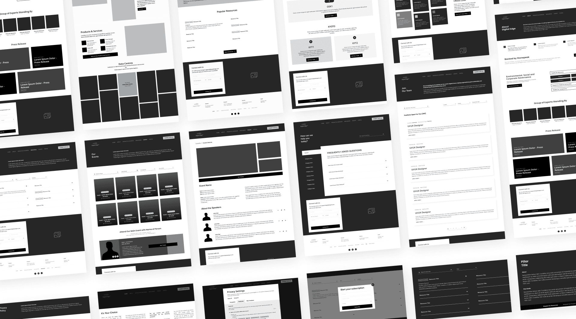
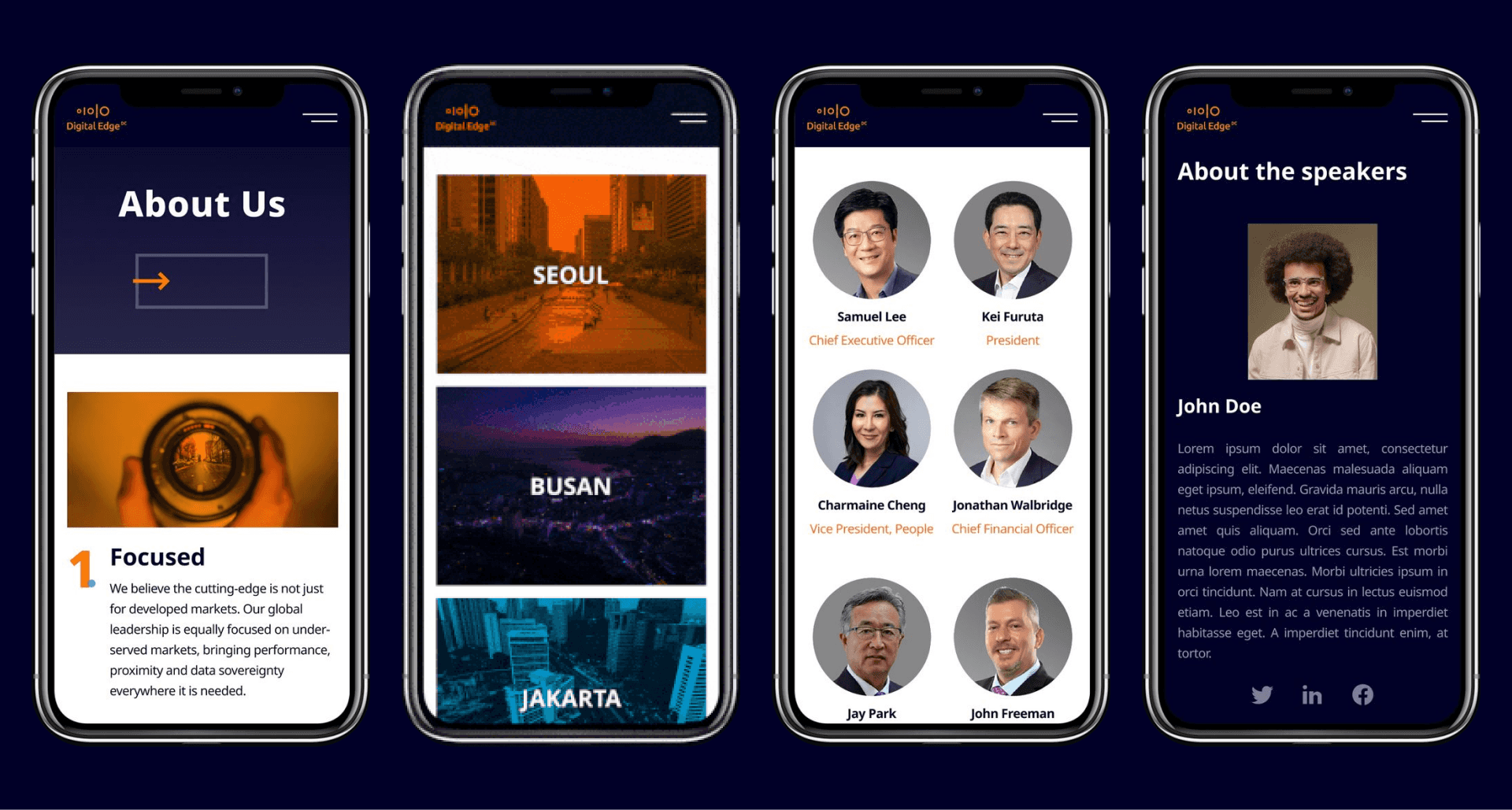
Using the information architecture as a foundation, we created detailed wireframes to map out the layout and functionality of key pages. These wireframes provided a clear structure for presenting information, helping align the design and functionality with the client’s goals.
Phase 4: Design System
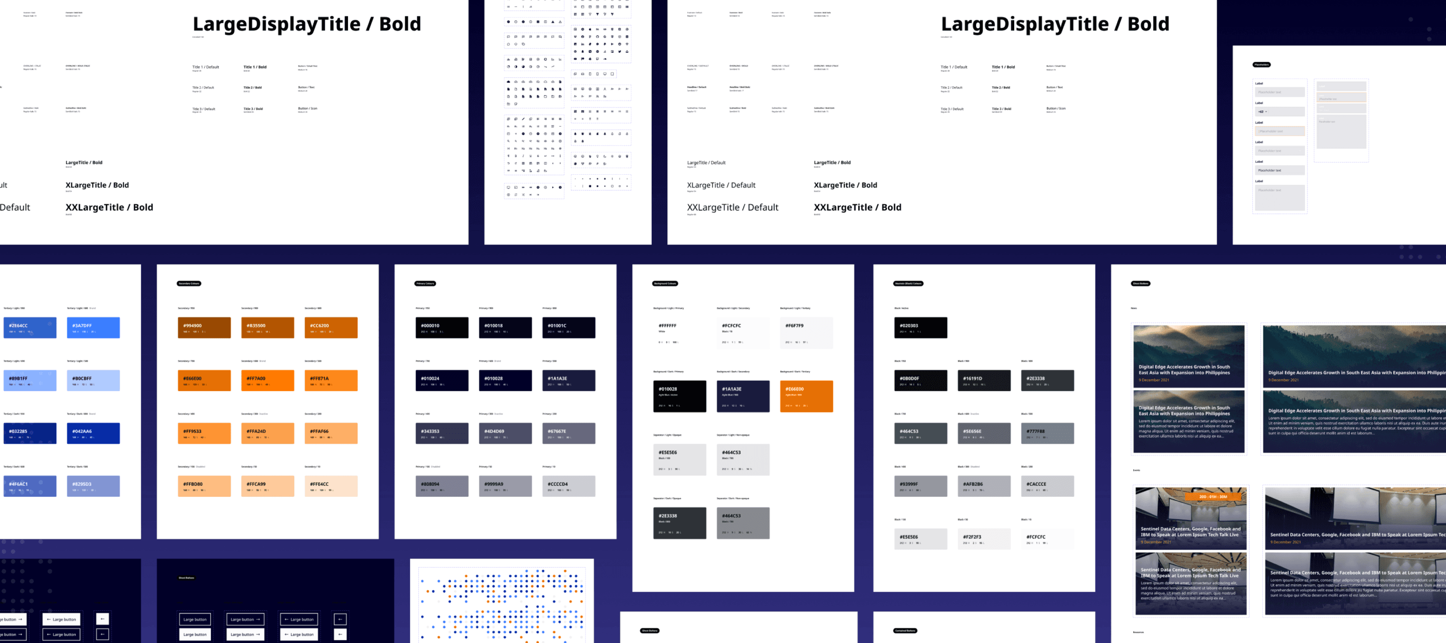
Building on the wireframes, we developed a modular design system to standardize visual elements and interactions. This system ensured consistency across the website and scalability for future applications, including the customer portal. Key components included buttons, typography guidelines, color palettes, and micro-interactions, all tailored to Digital Edge’s brand identity.
Phase 5: Prototyping
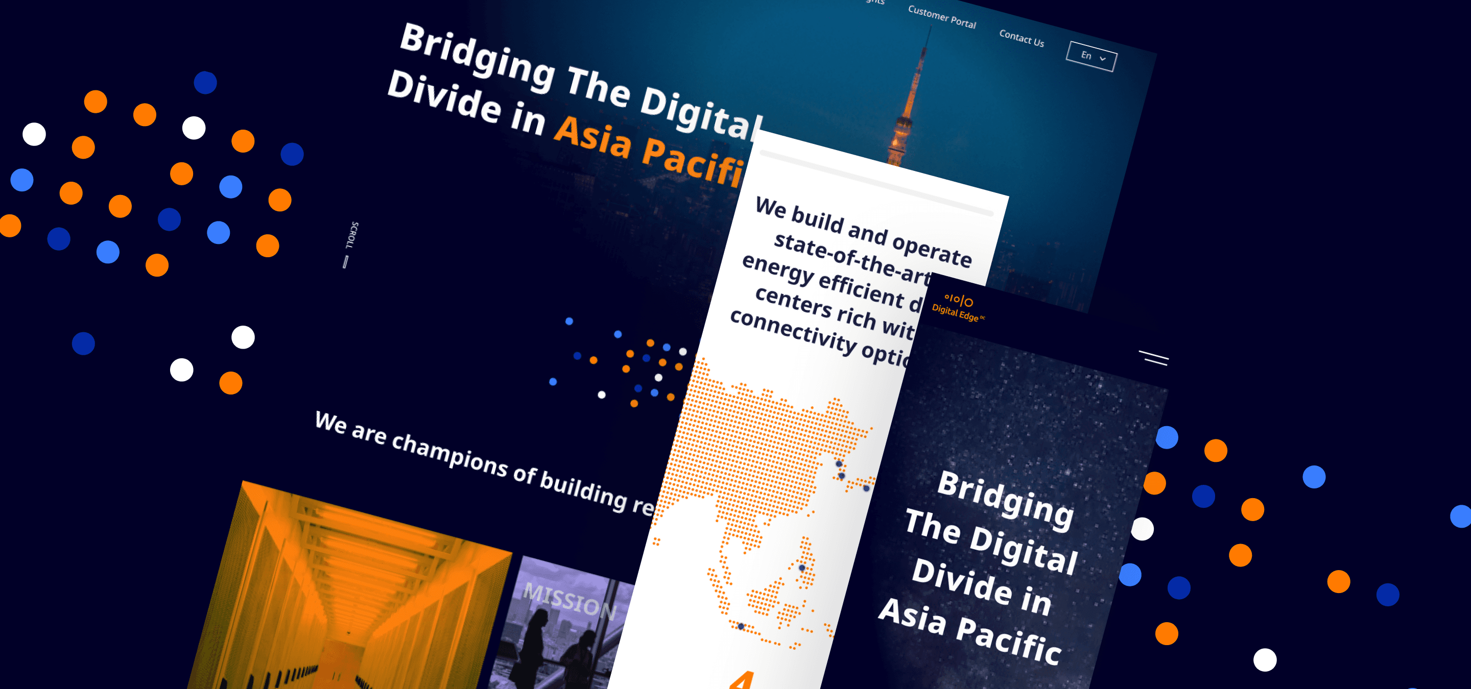
With the wireframes and design system in place, we created high-fidelity prototypes to visualize the website’s final form. These prototypes included interactive features and Hyper Grids, a unique visual branding element made up of strategically placed colored dots. The prototypes allowed us to refine the design and align it with the client’s vision.
Final Phase: Testing and Launch
Before launching, we conducted an internal user acceptance test (UAT) to ensure the website was seamless and intuitive. Feedback from the test allowed us to refine the experience further.


Impact
The new Digital Edge website is a responsive, multilingual platform designed to connect with a diverse audience while reflecting the company’s innovative approach. With features like Hyper Grids, accessible typography, and a clear, organized content structure, it sets a strong foundation for their digital presence.
